In honour of National Apprenticeship Week, I wanted to reflect on my apprenticeship at The Juice...
The Secret to Creating Memorable Content
Having well-practiced steps to follow when I’m creating statics for Instagram, Linkedin, Twitter and Facebook is paramount. Ultimately, this helps Fearless reach as many founders, followers and potential partners as possible!
 1- Let’s start with the basics- colour. Having a clear colour scheme for your brand identity which can be used across a variety of socials and for different purposes is super important. Building up the recognisability of your company and brand with colour is one of the first steps many designers take when staring at that ever daunting blank canvas on illustrator!
For example, think about Spotify- I’m sure many of you know that as black and green, YouTube as red and white, and IKEA as blue and yellow. According to a 2020 survey by wibbitz, it’s said that viewers only look at an Instagram post for between 3-10 seconds, so in that short amount of time, it’s crucial that use of colour is carefully and consistently considered as it’s one of the first things to be seen! Ensuring Fearless has a recognisable colour scheme and design tone of voice is certainly at the forefront of my mind when designing for our social media platforms.
 2- Trends. Now, trends can be something which you either love or hate, but this aside, they can be so helpful in increasing the reach and engagement of social media posts. As a designer, it’s second nature for me to be up to date with what’s going on in the world of graphic design, fashion and interiors. How I implement this into my design work is where the thinking comes! At the moment, clean, minimal graphics, muted brights, abstract type, and font pairings are certain things I see come up frequently, so are concepts I have tried to tie in with Fearless Adventures’ branding. Striking that balance between being inspired by trends while still adhering to the brand’s identity can be difficult, but when done right, it will (hopefully!) get someone to stop scrolling through their insta feed!
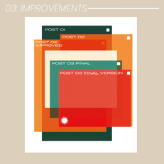
 3- Getting things wrong. This may seem like a weird one (especially in the ever-changing world of social media), but without that trial and yes of what works, you’ll always be playing it safe! Like with balancing trends and a brand’s identity, balancing your personal style with a company’s tone of voice can be difficult. Trialing different designs for one asset means that it’s as thought out as possible when something is posted and will do the job at hand! Developing both my own design skill and a company’s narrative can be a balancing act, but working with experienced marketers and other creatives makes this task not only easier but more enjoyable.
I’m sure in 6 months' time, even 6 weeks, I will have even more processes I use to create assets for Fearless Adventures- but for now, these are the ones that help me every day to create unique, on-brand and visually exciting design work!


